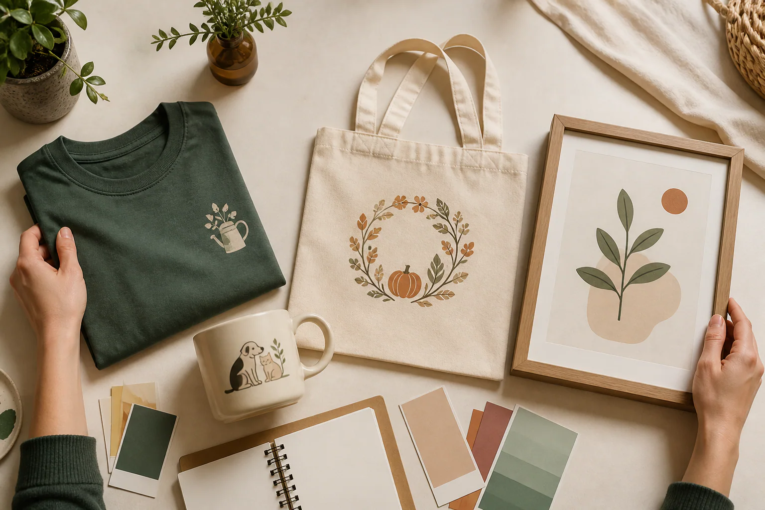
If you are deciding what to sell on Etsy, start with a product that makes one specific buyer feel recognised. The four Etsy product ideas below are print-on-demand product ideas chosen to expose different trade-offs: a focused slogan T-shirt, a pet-owner mug, an occasion-led tote bag, and a simple wall print. No option removes uncertainty. Each gives you a different way to match an audience, a design, and a buying occasion without building a large collection first.
This guide does not hand you a list of supposedly “hot” products and pretend that visibility equals demand. Instead, it shows you how to choose one idea, pressure-test it with information you can inspect, and launch a listing that produces a clear lesson even if the first result is modest.
What to sell on Etsy: compare four product formats
Begin with a one-sentence offer: “This is a [product] for [specific person] who wants [specific use or feeling].” If the sentence needs three audiences, several occasions, or vague words such as “unique” to sound interesting, the concept is still too broad.
Compare each candidate with four questions:
- Who recognises themselves in it? “Gardeners” is an audience; “allotment growers who enjoy dry humour” is a usable creative boundary.
- Does the artwork suit the printable area? A short phrase can work on apparel but look empty in a large frame. A detailed illustration can carry a print yet become unreadable on a mug.
- Can the price absorb the real costs? Include production, shipping assumptions, marketplace charges, discounts, and the margin you need before committing to several variants.
- Will the first listing teach you something? A narrow idea lets you change one variable at a time. A mixed collection makes it difficult to tell whether the audience, product, artwork, price, or presentation caused the result.
A useful candidate does not need perfect scores. It needs an identifiable buyer, artwork that belongs on the product, manageable economics, and a weakness you can improve deliberately.
Compare four practical product formats
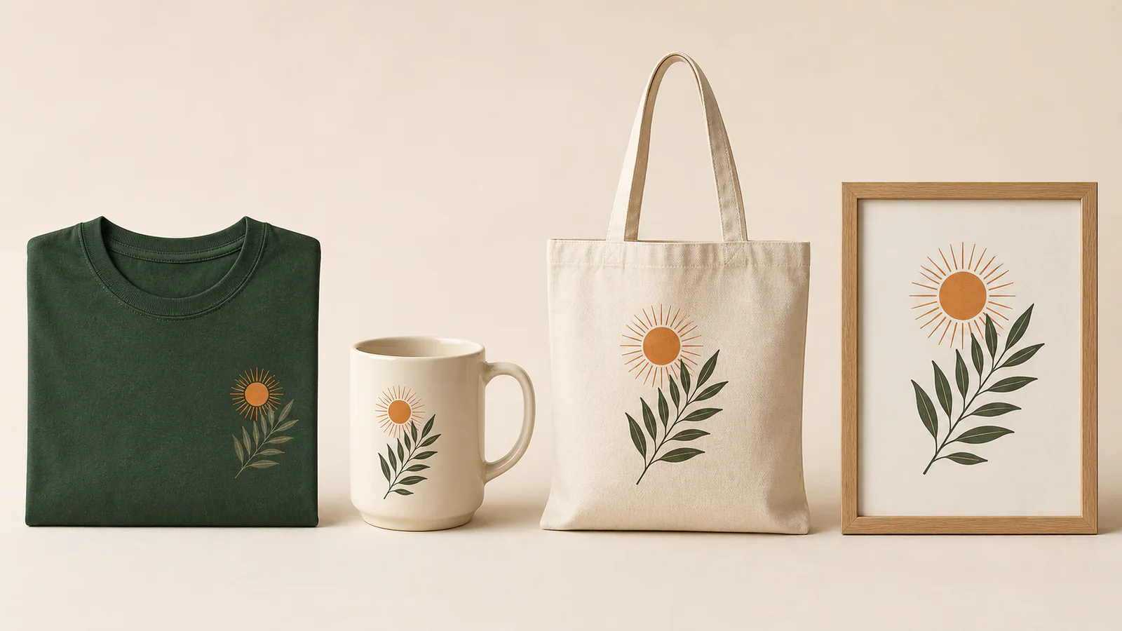
The same theme behaves differently across products. A compact motif may feel intentional on a shirt, while a wall print needs more visual space. A mug introduces curvature and a tote creates a tall, flexible canvas. Judge the combination, not the illustration in isolation.
| Product format | Strong starting point | Main constraint | Check before launch |
|---|---|---|---|
| Focused slogan T-shirt | You understand the audience's language and can build a clear type hierarchy | Generic phrases and weak thumbnail contrast disappear among similar listings | Check the design at search-thumbnail size and preview every garment colour you plan to offer |
| Pet-owner mug | The idea connects a recognisable owner identity with a gift or daily routine | Long wording and detailed art can wrap awkwardly around the printable area | Confirm both visible sides, the handle position, and the safe print zone |
| Occasion-led tote | The product has a reason to be carried at a club, hobby event, trip, or recurring activity | A one-date message may have a very short useful life | Check whether the design still makes sense after the occasion has passed |
| Simple wall print | The subject and room context can carry a larger, flat composition | A style label alone does not define a buyer or purpose | Preview every crop and size; confirm that the focal point remains clear in a room mockup |
A slogan shirt suits a seller whose strongest skills are writing and typography. The phrase must express a point of view, not merely name a hobby. One hierarchy and one supporting graphic are usually a stronger first experiment than several effects competing for attention.
A pet-owner mug already suggests a daily ritual and a gifting context. Make the idea personal enough to feel chosen, but not so private that only one person understands it. The design should be composed for a cylinder rather than pasted onto a rectangular preview.
An occasion-led tote works best when the object and the activity belong together: a recurring book-club meeting, gardening group, makers' market, or hobby weekend. Repeating occasions are easier to plan around than a single date, unless you intentionally want a short campaign.
A wall print gives illustration more room, but “retro” or “minimal” is only a treatment. “Minimal botanical kitchen print for herb growers” adds a subject, room, and recipient. Those details tell you what belongs in the artwork and what should be removed.
Worked example: a gardening T-shirt for allotment growers
Suppose the initial idea is “a funny gardening shirt.” That is too broad to guide the artwork or listing. A more useful offer is: “A dry-humour gardening T-shirt for allotment growers who recognise the small frustrations of keeping a plot alive.”
The audience is now specific enough to influence the language. Instead of a generic gardening quote, the concept can reference a familiar situation—unpredictable weather, stubborn weeds, or the optimism of planting another row—without copying an existing slogan. Keep the first artwork simple: one original line of copy, one restrained supporting motif, and enough contrast to read on the shirt colours you actually plan to list.
Next, inspect product fit. Shrink the mockup until it resembles a search thumbnail. If the joke disappears, remove decorative details before enlarging the wording. Check light and dark garment colours separately; an effect that looks polished on forest green may lose its hierarchy on cream.
Then calculate the price from the bottom up. At the time of this review, Etsy Fee Basics lists a US$0.20 listing fee and a 6.5% transaction fee, while payment-processing charges vary by country. Other charges can apply, so use the official page and your payment account rather than copying a percentage from an old article. The purpose is not to predict profit perfectly; it is to reject a product whose margin only works when normal costs are ignored.
Finally, write the listing for a person, not a keyword counter. Etsy's 2026 listing-title guidance emphasises clear, buyer-friendly titles and explains that search considers listing information more holistically than a title packed with repeated phrases. A title such as “Dry-Humour Gardening T-Shirt for Allotment Growers” communicates the product and audience at a glance. Materials, fit, production details, and care instructions belong in the description rather than being replaced by a string of near-duplicate keywords.
This example is deliberately bounded. One audience, one joke, one product, and a small colour set make the outcome interpretable. If shoppers engage with the concept but not the listing, improve presentation. If the message receives no meaningful response, change the idea before multiplying it across mugs, totes, and prints.
Check the market without confusing visibility with demand
Create three or four precise audience-and-product phrases, then use the POD Niche Gap Finder to compare visible marketplace supply. Treat the result as a snapshot of what can be observed, not proof of buyer demand. Low visible competition can mean an opening, but it can also mean that few people search for the idea.
Continue with a manual Etsy review. Record the product formats shown on the first page, repeated visual treatments, price presentation, mockup quality, and whether the listings speak to a clearly defined buyer. Do not search for a design to copy. Look for a communication gap: perhaps many generic pet mugs appear, but few address a recognisable owner situation with readable, gift-ready artwork.
Presentation belongs in the research because the first image shapes what shoppers understand. Etsy's product-photography guide recommends clear main images and photos that communicate size, colour, materials, purpose, and feeling. It also notes that listing photos may appear in multiple crops and ratios. Your first mockup therefore needs to remain understandable outside the full listing page.
Keep facts and interpretations separate in your notes. “Twenty similar tote bags were visible” is an observation. “Buyers want another tote” is an assumption. The first can inform a decision; the second still needs a real-world response.
Build one listing that gives you a clear next move
Choose one candidate and freeze the main variables for the first launch. One audience, one product, one central idea, and one visual treatment are enough. Then work through this sequence:
- Write the one-sentence offer and remove every audience or occasion that does not belong.
- Create the artwork for the real printable area; inspect it at thumbnail size and on a realistic product mockup.
- Use the marketplace tag generator to organise relevant listing language after the concept is fixed, not to invent the concept for you.
- Decide in advance what would justify another iteration: a favourite, a sale, stronger click activity, or a specific presentation problem you can correct.
- Save the starting assumptions in your yoou.io research workspace, then use the Shop Visibility tracker only when there is a live listing and a defined query worth monitoring.
If the production partner, fulfilment model, or available catalogue is still unresolved, read our guide to choosing print-on-demand tools before expanding. That choice affects product availability, mockups, delivery expectations, and how much setup you will repeat.
The first listing is not a verdict on your shop. Its job is to turn a broad idea into one observable result. Keep what the result supports, change one weak variable, and stop scaling anything you cannot yet explain.